Empowering Every Data User:
Introducing the New DataHub Cloud Experience
TLDR: The new and improved user experience will be enabled for all users of DataHub Cloud by default starting October 8, 2024. Get a quick tour here!
How We Got Here: The Past Year at DataHub
Since we released the first version of DataHub Cloud, our enterprise-ready hosted solution, the product team at Acryl has worked closely with organizations large and small to solve problems around:
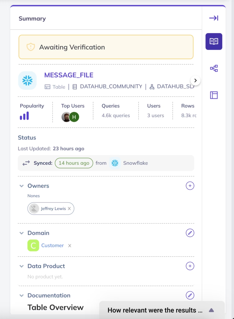
- Data Discovery & Lineage: By enabling data teams to scale by placing a record of all data assets — tables, dashboards, data pipelines, and AI models — along with their technical details and lineage behind a single, unified pane of glass. By allowing data consumers to find and use the most trustworthy data, fast.
- Data Governance and Compliance: By offering tools to organize, classify, tag, and establish accountability around data. By automating cumbersome governance processes at scale to strengthen regulatory compliance & streamline data management.
- Data Observability: By providing frictionless means to monitor and alert around the quality of your most important data assets along dimensions of freshness, accuracy, completeness, and structure.
As we’ve worked closely with customers to deliver these solutions, we’ve taken careful note of common patterns or themes in the feedback we receive. A few critical themes have come up time and time again as we attempt to gain traction within an organization: accessibility, ease-of-use, and simplicity.
Making Data Accessible to All
As data becomes more of a competitive advantage for organizations, driven by demand for data across business analytics and AI use cases, a wider range of people — Business Analysts, Decision Makers, Marketing Associates, and more — within the organization are naturally being required to interface with it.
While these specialists may not be directly involved in querying or producing the data, their day-to-day job functions are increasingly driven directly or indirectly by data, necessitating a deeper understanding of data assets, their origins, and their relationships. This shift requires them to engage with data governance, ensure data quality, trace data lineage, and make informed decisions based on reliable insights, all while adhering to compliance standards and ethical data use practices.
As data applications spread across organizations, DataHub Cloud must follow suit — supporting everyone from application developers to business analysts to CTOs.
This means simplifying the experience, so that anyone can understand the most critical pieces, e.g., providing the human context around the data and answering questions like…
- Who is responsible for the data?
- How popular is the data? Who uses it?
- What use cases does the data power?
- Where does the data come from?
- Does the data include any PII or sensitive information?
- Is my organization’s data secure?
…without being required to understand all the technical specifics of how to use the data.
Making A Change
In reconsidering our v1 product in the context of this feedback, it was clear that we could not effectively deliver on this feedback without first making some fundamental changes to our product.
The product team at Acryl decided that a major shift was required to accommodate a broader set of needs — both those of the ‘data experts’ or admins directly responsible for the health of data within an org, and of the ‘data consumers’ or more casual, adjacent users who are eager to explore, understand, govern, monitor, and use data within the organization.
Introducing the New DataHub Cloud
Today, we are excited to announce the production availability of a reimagined DataHub Cloud experience, which the product team has worked tirelessly to develop, verify, and refine with the help of our wonderful customers over the past year.
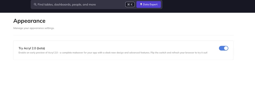
As of today, we’re thrilled to report that a majority of users on DataHub Cloud are already using the new experience, which any user is able to enable themselves from Settings > Appearance.
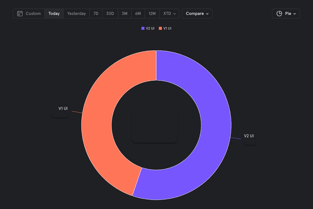
Starting on October 8, 2024, the new user experience will become the default experience for all users of DataHub Cloud. Have questions about DataHub Cloud? Join our DataHub Slack Community to continue the conversation.
See What Happens Next below for additional information about the timeline.
Accessible, Intelligent, Easy to use
Centered around themes of accessibility, ease-of-use, and intelligent automation, some highlights of the new experience include:
- Pick Up Where You Left Off: A completely redesigned homepage focused on getting you back to the things you care about, as well as discovery and exploration of your organization’s data and domains.
- Unified Search & Platform Browse: A unified and context-rich search and platform-browse experience to reduce the time to find and explore data across the entire organization.
- Streamlined Data Lineage: A refresh of the Lineage Graph experience that seamlessly blends data transformations (queries, data pipelines, and dbt models) and data assets (columns, tables, dashboards, and AI models).
- Automation & Intelligence: AI-powered tools and automations to help make time-intensive manual processes like data documentation and data classification easy and simple.
- Rich Personalization: Introduction of user “personas” to help narrow the focus to only the things that matter to you.
Let’s dive deeper into each of these below.
Pick Up Where You Left Off
One of the key pieces of usability feedback we received on the v1UI was around getting back to the things that DataHub users cared about most: the tables they are responsible for, the tables they are subscribed to / interested in, the glossary terms, domains, or data products they have created, pending action items like tag and glossary term proposal reviews, or simply the data that they were recently browsing. Previously, we had no easy ways to quickly navigate to these things in a way that felt personalized, leaving the end user on their own to remember and revisit the data they care most about and instead choosing to focus on the discovery of new data.
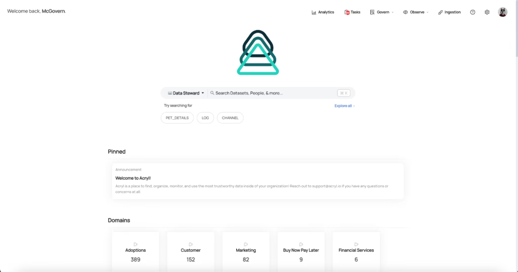
With the new UI, we sought to rethink the homepage experience with this feedback in mind. We looked to the tools that were best at getting us back to the things we cared most about for inspiration, drawing from interactions found on tools like GitHub and Linear.
What resulted is an experience that focuses on providing the most relevant context for a user based on their previous actions on DataHub. This includes:
- The assets the user is subscribed to
- The assets the user owns
- The glossary terms, domains, and tags that the user owns
- The groups the user is a member of
- Recently viewed tables, dashboards, data pipelines, and more
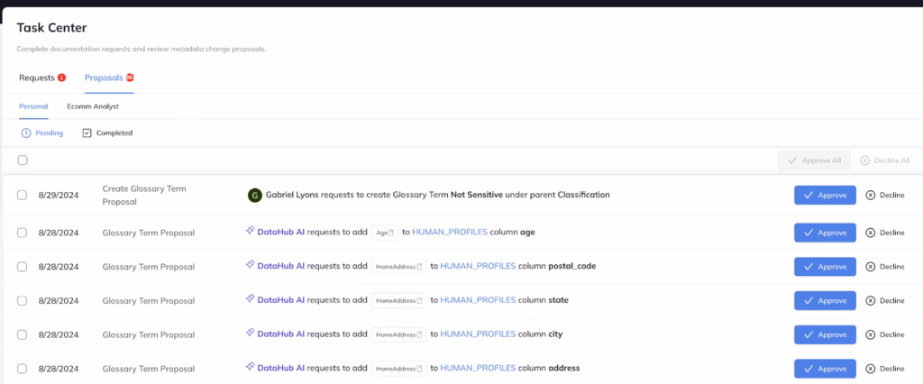
- Pending change proposals — crowd-sourced tags, glossary terms, and descriptions — are ready for review
- Pending documentation requests, as part of the new Governance Initiative Forms capabilities
- Unread announcements from Admins
Although these pieces of information are most relevant to frequent power users, we did not want to detract from the more casual user experience. Thus, we’ve retained a secondary focus on data discovery by continuing to highlight top Data Domains, Data Products, and Data Platforms in addition to a new For You section, which highlights the notable data assets you may be interested in. This includes the Most Popular Tables and Dashboards, the Most Recently Updated or Created Tables, and more!
Unified Search & Platform Browse
In the v1 UI, we provided a navigational browsing experience to help users quickly find data based on how the data was physically organized in the tools where it lived. For example, enabling people to navigate databases and schemas to find a particular table or view to explore data inside tools like Snowflake, BigQuery, or Redshift. Or to browse through folders of Dashboards, Reports, and Charts for tools like Looker, Power BI, and Tableau.
In the initial implementation, the browse experience was focused on “asset types”, which are a set of standardized concepts modeled by DataHub, including a ‘Dataset’, a ‘Dashboard’, and other kinds of data assets that an organization collects. We [incorrectly] believed that people would want to separate their search space by their type first and foremost, assuming that data engineers would prefer to browse datasets — tables, views, and streams — and data transformation pipelines, while data analysts and business users would prefer to browse consumable data artifacts like dashboards, charts, and reports.
Pretty quickly after rolling this out, we started to receive feedback from users. And not the positive kind. Many were not able to find the thing they were looking for, or even worse, were altogether confused about the purpose of the navigational browse experience.
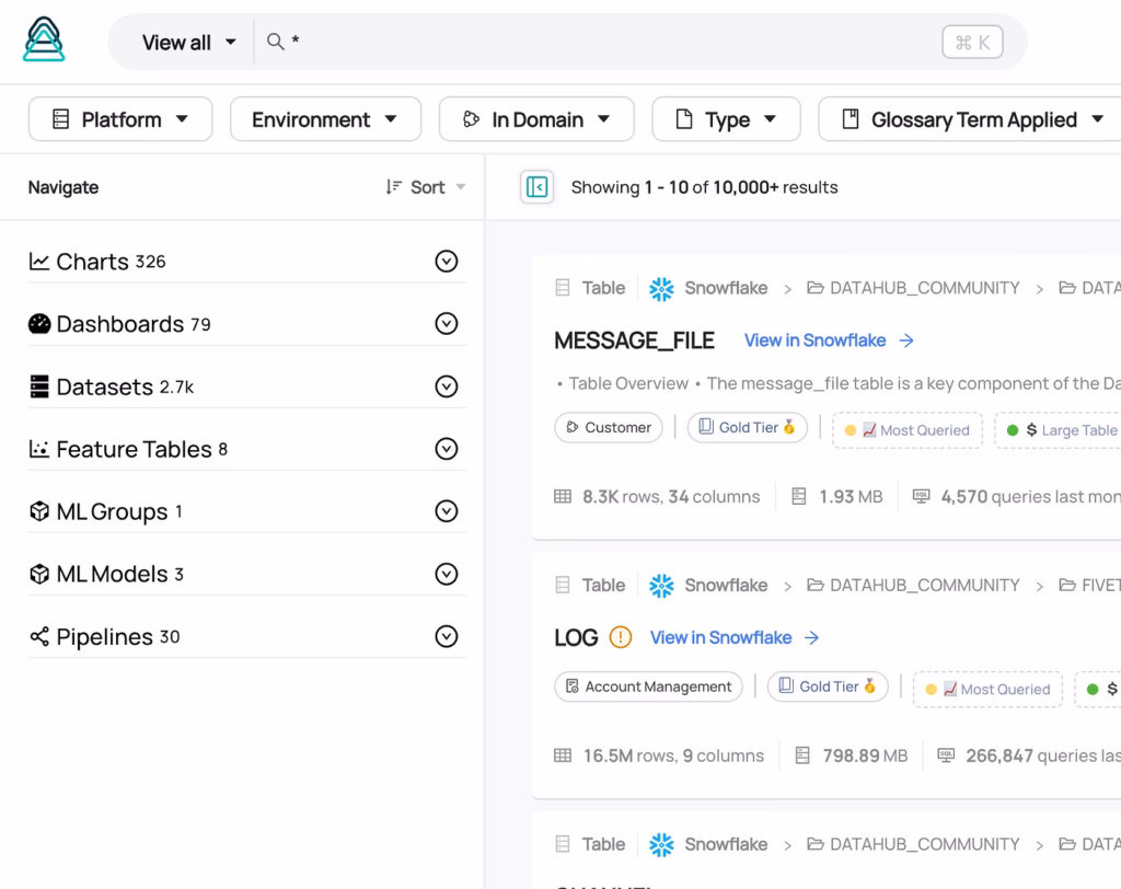
When probed on what they were hoping to find, we realized that people often described this in terms of the platform where the data resided, and used the ‘native’ asset type, not the standardized set of types we had initially thought were such a good idea. The “users table on Snowflake”. The “user-purchases join job in Airflow”. The “production purchases” model in dbt. These were the ways end users described what they were looking to find in the data catalog.
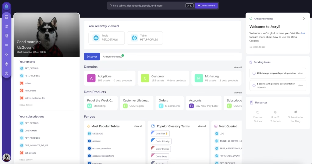
So with the new UI, we decided to make a change to the browsing experience. Specifically, we chose to replace the standard asset-type-based organization with a platform-oriented approach that would hopefully make new users feel at home within DataHub from day 1.
With a new platform-first browse experience, we aim to reduce friction by putting familiar concepts in front of people, so they can discover data in a way that feels natural immediately, and removing the need to learn the new set of concepts (the standardized entity types) to explore their data.
… and here’s what we ended up with:
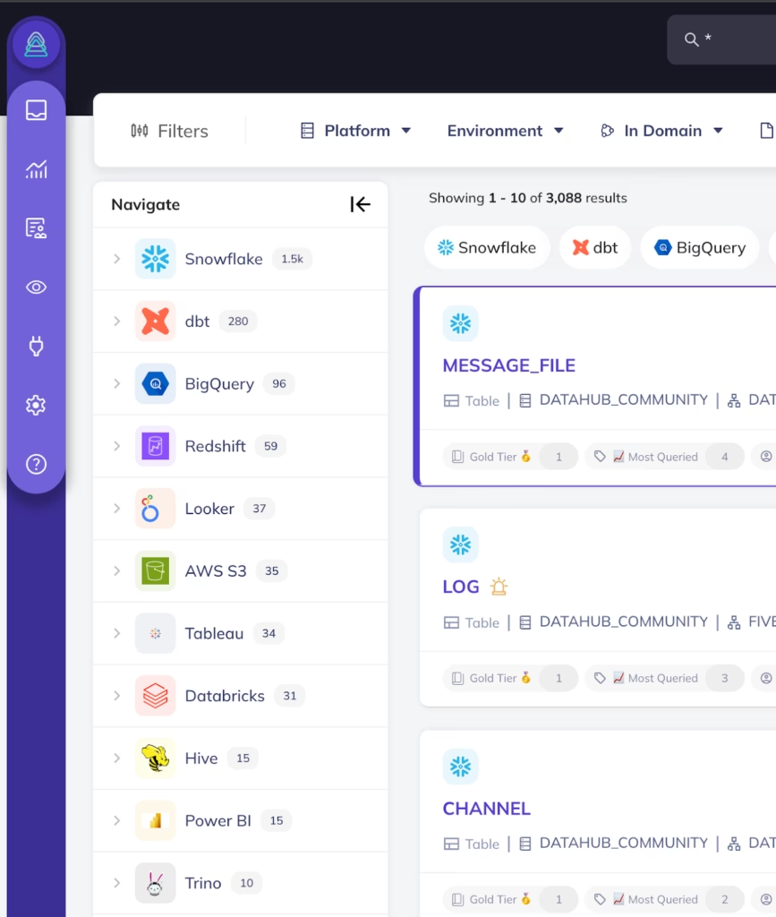
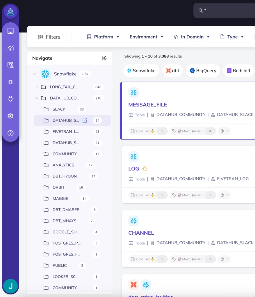
This enables users to browse for data in the same way that they would in a native data platform like Snowflake, BigQuery, Databricks, Looker, etc.
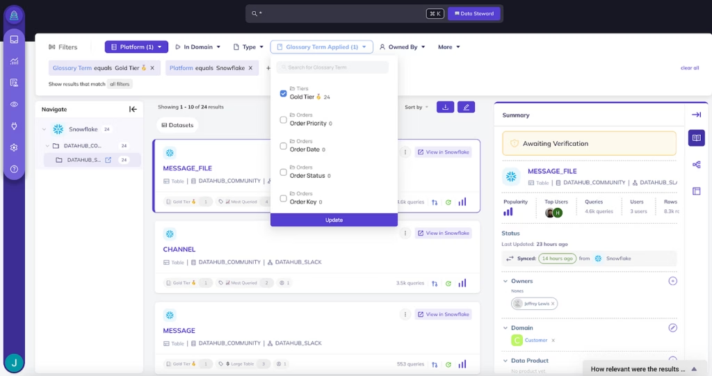
Further, we allow you to combine text search and logical filters — filtering by tags, glossary terms, ownership — with the navigational layout of the data:
You’ll also notice that we’ve attempted to reduce the clicks required to find what you’re looking for by embedding rich data asset previews directly within the search experience.
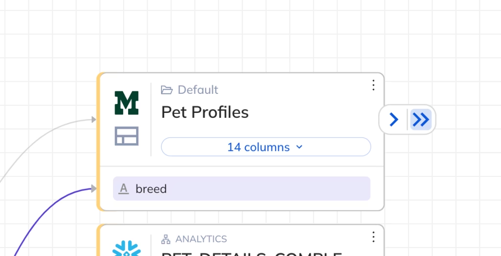
Streamlined Data Lineage
Since the beginning, the data lineage experience on DataHub has been one of the most widely used features across both the open-source and cloud versions. It is incredibly powerful, providing clear visibility into where specific data originates and the use cases that it powers, such as downstream dashboards, reports, AI models, and more.
That being said, the v1 lineage experience had some important limitations. A few capabilities our users had repeatedly requested included:
- Ability to filter out transformations — dbt jobs, Airflow tasks — and focus just on the data
- Ability to collapse expanded lineage
- Ability to expand more than 1 level downstream or upstream in a single click
- Ability to deep dive into the lineage for a particular column-level lineage
- Ability to show and hide nodes for a large level of lineage
- Faster load times for upstream and downstream lineage levels
Users were looking for ways to accomplish those tasks while keeping the rich experience around column-level lineage, filtering lineage by time, and rendering tables, views, data pipelines, charts, and dashboards.
So these are exactly what we focused on in developing the second version of lineage:
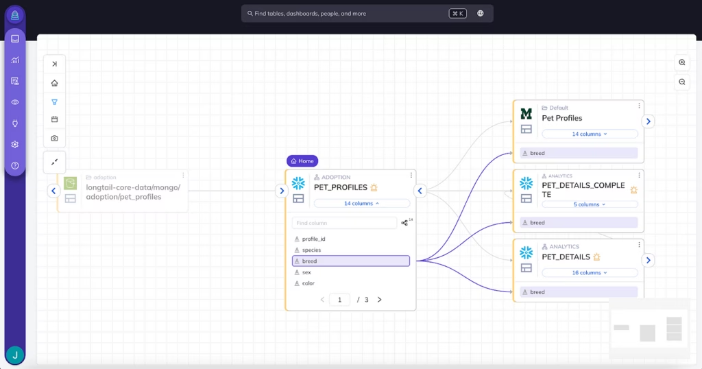
Featuring the ability to:
- Expand and collapse multiple levels of lineage in a single click
- Hide and show transformations directly within lineage in a single click
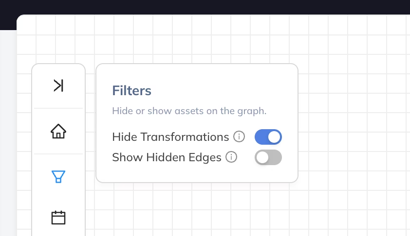
- Hide and show “unresolved” or hidden edges to upstreams or downstreams
- Expand and collapse nodes in a large lineage level
In addition, we’ve optimized querying and caching on the lineage experience to dramatically reduce page load time and increase the size of supported lineage graphs, making the experience feel more responsive than ever before.
Automation & Intelligence
About a year ago, right around the time that the first version of ChatGPT was released, we spun up an initiative at Acryl to evaluate how generative AI could begin to be applied to the toughest problems our customers were facing. We narrowed in on a few key use cases around data governance, data discovery, and data observability, including:
- Generating Data Documentation to help data governance teams quickly get documentation defined for all tables and columns.
- Applying Custom Data Classification Labels (Glossary Terms) helps data governance teams quickly identify sources of sensitive data (PII).
- Generating Data Quality Assertions to help data engineering teams quickly get data quality monitoring in place across mission-critical tables and columns.
We began to experiment with AI across each targeted use case.
Having previously built AI-based classification workflows at LinkedIn, the founding team at Acryl was keenly aware of the risk of assuming AI will magically solve every problem. As the team experimented with the latest LLMs, we confirmed our previous realization: AI is not a silver bullet, but more so a capable assistant that can inform and complement humans.
In high-stakes use cases like quality and compliance, getting things right ultimately requires review by experts in the particular business domain — humans. So we honed in on our approach, building frictionless workflows that enable humans to review of high-quality AI-generated recommendations.
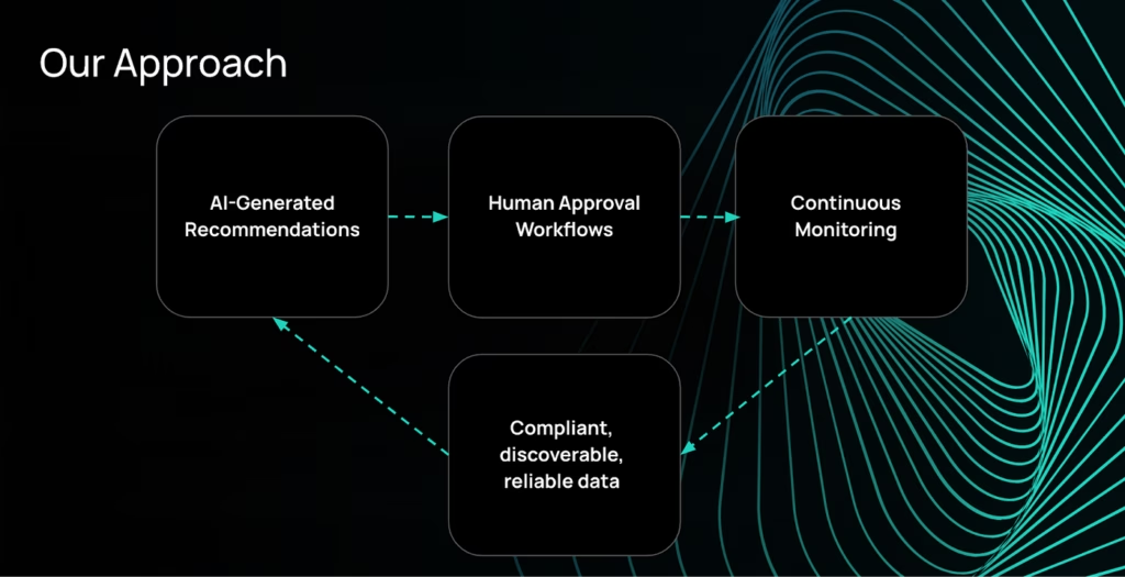
As a result, we’ve shipped a few exciting capabilities that will be available in the new experience:
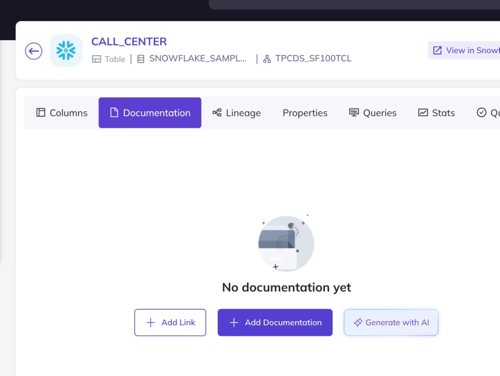
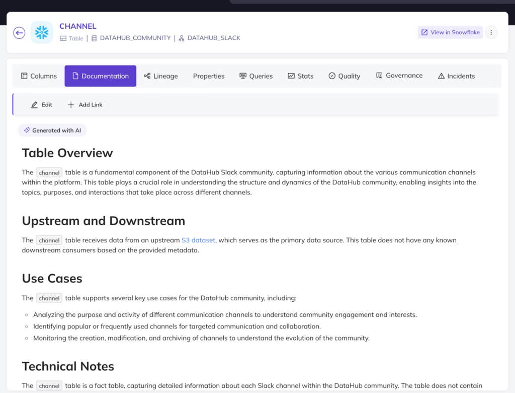
- Generate, review, and apply AI-generated documentation for tables and columns:
- Generate table and column classification labels or business terms automatically using custom glossary terms
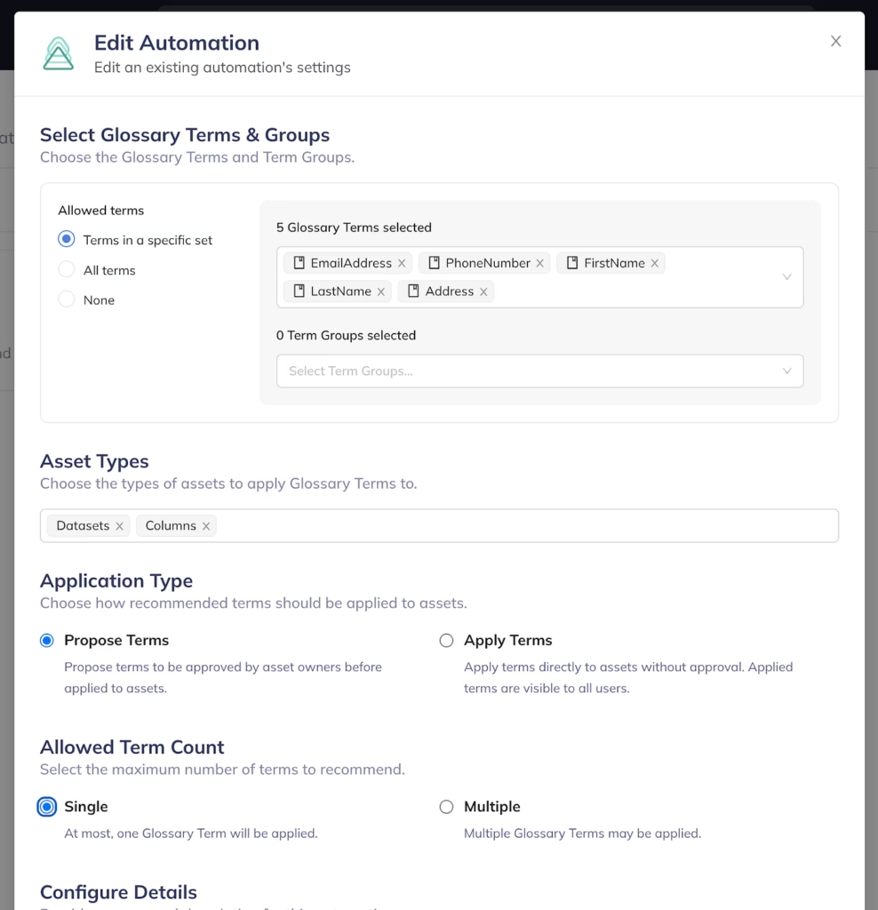
… and review the generated classification labels before they are officially applied:
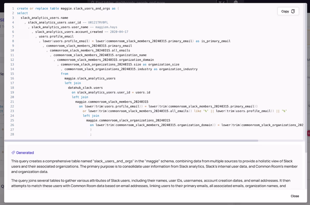
- Generate detailed summaries for complex SQL queries on demand:
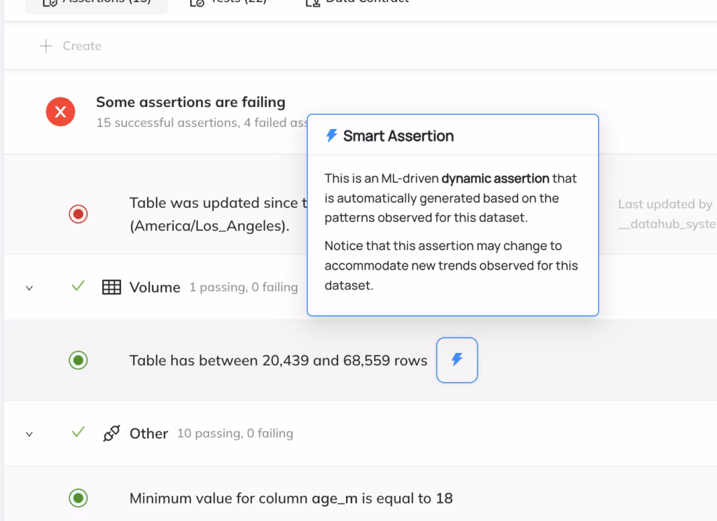
- Generate, review, and turn on “Smart Assertions”, or dynamic Data Quality rules trained on the historical patterns in your data, to catch data incidents as soon as they occur:
It’s been a long journey, but we are proud to announce that AI-powered experiences are finally a first-class citizen in DataHub Cloud. We’re incredibly excited to get these powerful capabilities in the hands of our new and existing customers.
Note that these features are currently in beta. If you’re looking to get a head start, reach out to your Acryl Customer Support representative (or help@acryl.io) to enable these capabilities.
Rich Personalization
The final theme we heard repeatedly was regarding making DataHub Cloud easier to use for less technical users.
From the start, we’ve focused on providing a comprehensive “360-degree view” of every data asset within an organization, including both the technical components (sizes, stats, columns & types, lineage, etc.) AND the human components (documentation, ownership, classification, etc.). Moreover, we’ve built the search experience around both physical assets — actual columns and tables — and logical concepts like domains, glossary terms, and data products.
Although this context is useful to data experts — the people who live and breathe data as part of their day-to-day work — it can be overwhelming to others who may be more interested in the less technical components around data governance and stewardship.
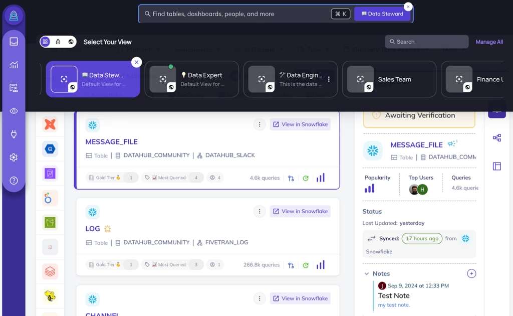
As part of the v2 experience, we are introducing the first version of Personas, building on search Views to enable the experience to be tailored to individual users of varying kinds, with pre-defined personas for:
- Data Experts
- Data Engineers
- Data Stewards
- Data Users
By selecting a persona, your experience on DataHub will be adjusted, by showing and hiding relevant assets within the search and browse experience (e.g. using Views) and modules (e.g. recommendations on the homepage) by default.
Today, users will choose from this set of predefined personas, but we intend to extend this to include fully customizable Personas for your organization. With Personas, we hope to provide a delightful, rich user experience for every person within the organization.
What Happens Next
October 8, 2024 — Production Release
On October 1st, the new experience will be released to all users of DataHub Cloud as the default production user experience. If you find yourself needing to disable the experience, you will still be able to revert to the more familiar 1.0 experience by navigating to Settings > Appearance and changing the toggle for “Try Acryl 2.0 UI” to the “disabled” state.
Early January, 2025 — Concluding Support for 1.0 Experience
Assuming all goes well with the October 1st rollout, support for the 1.0 experience will be officially dropped in a follow-up release. We are tentatively targeting a removal date for the 1.0 experience of January 1, 2025.
Final Thoughts
Finally, from the entire team here at DataHub, I’d like to thank our customers who have had the time, energy, and patience to provide incredible feedback throughout this journey together — you know who you are! This work could not have been possible without your guidance and support.
Of course, our work does not stop here. We intend to continue to listen closely to your feedback and improve the experience for all of your stakeholders.
Stay tuned for more updates coming soon, and reach out to your DataHub support representative with any questions or concerns you have in the meantime.